

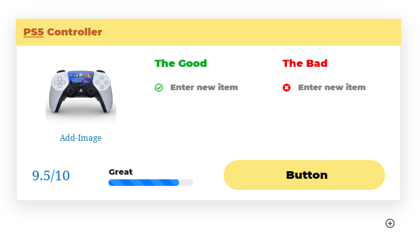
In this tutorial, we are going to talk about the Good Bad Block. This block lets you quickly summarize the good and the bad points of a product, and helps customers make decisions quickly. This is a simple example of a Good Bad Block.
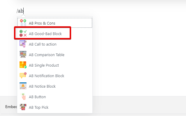
You can add this block to any post or page by adding if from the block menu, or by typing “/ab” and selecting it from the list.
Since the Good Bad Block is a Gutenberg block, all the settings for it we available in the WordPress block menu on the right side. Here is an image that shows all the settings available for the Good Bad Block.
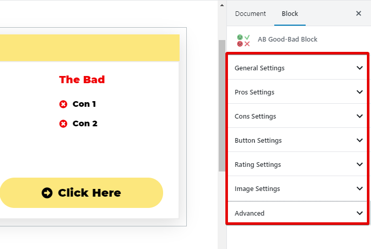
Let us explore each of the settings and understand how they can be used to customize the block.
General Settings
Here are all the settings in the General Settings section.
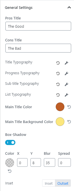
The settings are pretty straightforward and easy to understand. Here is a quick overview.
- Pros Title: Lets you change the title of the positive section
- Cons Title: Lets you change the title of the negative section
- Title Typography: Lets you change the typography of the Title
- Progress Typography: Lets you change the typography of the text above the progress bar
- Sub Title Typography: Lets you change the typography of the Sub Title
- List Typography: Lets you change the typography of the List
- Main Title Color: Changes the font color of the main title
- Main Title Background Color: Changes the background color of the main title
- Box-Shadow: Lets you enable and customize the box-shadow for the block
Here is an image that will explain the relationship better.
Pros Settings
The Pro Settings are easy to follow. Here is an image showing all the settings.
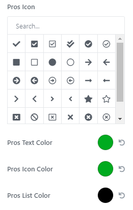
Here is what each of the settings does.
- Pros Icon: Lets you choose the icon next to the list
- Pros Text Color: Lets you choose the color of heading
- Pros Icon Color: Lets you choose the color of the icon
- Pros List Color: Lets you choose the color of the text used for the list
Cons Settings
The Con Settings are similar to the Pro Settings. Here are all the settings.
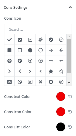
Here is what each of the settings does.
- Cons Icon: Lets you choose the icon next to the list
- Cons Text Color: Lets you choose the color of heading
- Cons Icon Color: Lets you choose the color of the icon
- Cons List Color: Lets you choose the color of the text used for the list
Button Settings
The button settings have a lot of settings. Here is an image showing all of them.
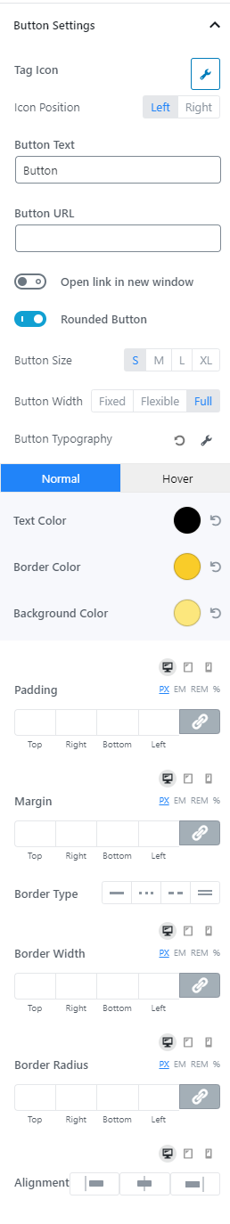
We will divide them up so you can follow along better.
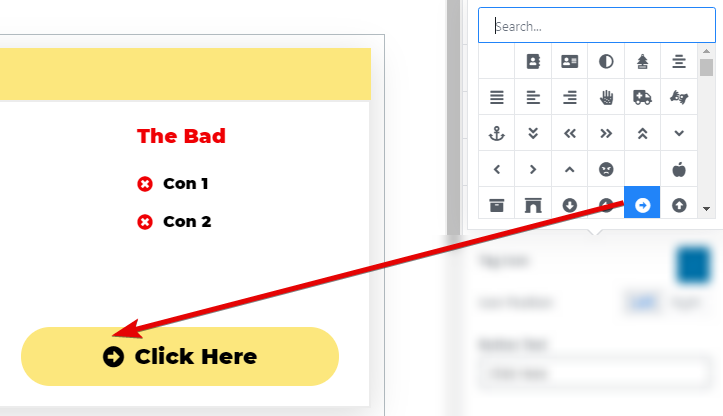
Button Icon
This option lets you pick an icon that will show alongside the button copy. You can also choose to place the icon before or after the text.
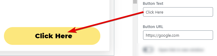
Button Text and URL
The button text field lets you set the text that appears on the button, and the URL is where you enter a fully-qualified URL of where the button should point to.
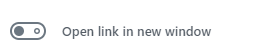
Open In New Window
Enable this option if you want your button to open in a new window.
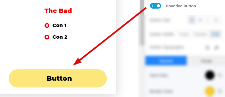
Rounded Button
Enable this option if you want your button to be rounded.
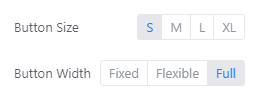
Button Size and Width
You can control the size and the width of the button with these settings.
Button Typography
Click the wrench icon to open the typography options.
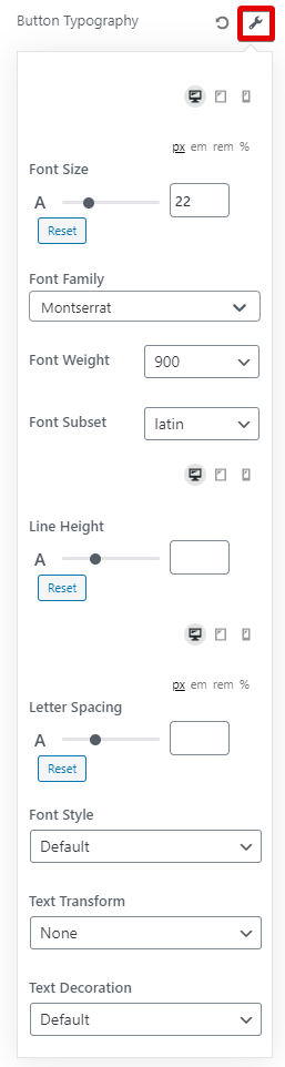
These are all the options you can configure for the button typography. You can choose the font, weight, spacing, and many other features to create the perfect typography combination.
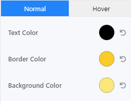
Button Colors
These options let you choose the color of the button copy, the background color, and the border color. You can configure them separately for the button’s regular state and the hover state.
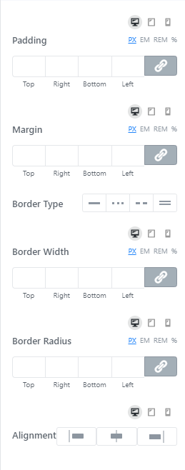
Button Padding, Margins, Borders, Width, etc.
These options let you configure the padding, margins, etc. for the button. You can customize them for desktops, tablets, and mobiles separately.
Rating Settings
Here are all the settings in the Ratings settings.
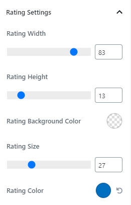
The settings are self-explanatory, but here is an image showing what settings affect which element.
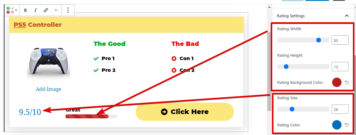
Image Settings
The Image Settings have just a few options.
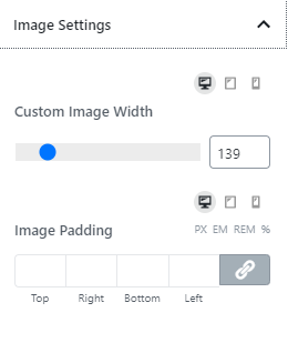
Here is what the settings do.
- Custom Image Width: Helps you set the image width. You cannot set a width that breaks the block layout
- Image Padding: Helps you change the padding around the image
Remember, both these settings can be customized for different device types and also by using the many CSS size selectors.
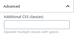
Advanced Settings
Here you can enter the name of CSS classes that you want to add to the CBB. This feature is useful to customize something that is not available in the settings directly.