

In this article, we'll be talking about the Call To Action Block in the AffiliateBooster theme. As the name suggests, the Call to Action Block will encourage your users to take action. You can use the CTA block to link to affiliate products, collect emails, and do all sorts of fun stuff.
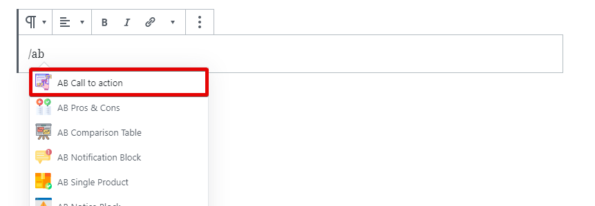
To get started with the block, add it to a page or post. We will add it to a new post for the demo.
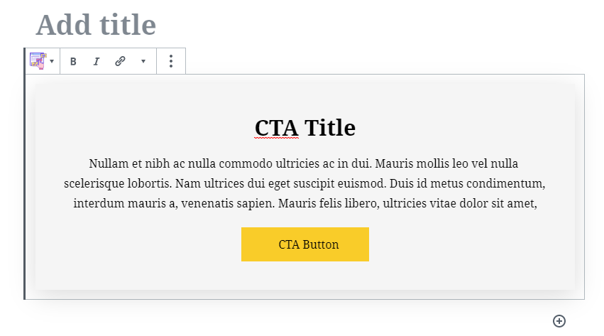
Once added to the post, here is what the default block looks like.
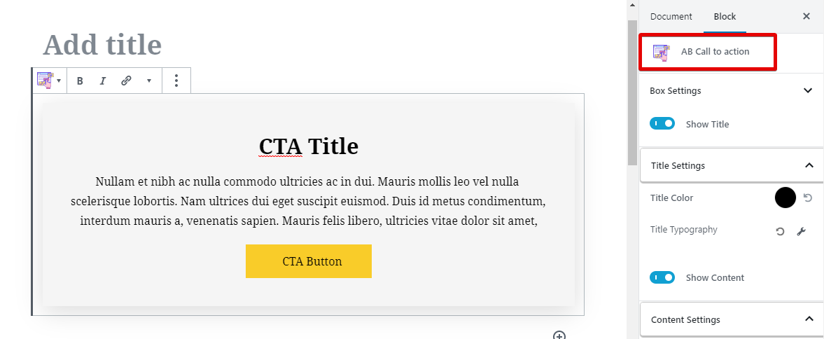
Since this is a Gutenberg Block, all the settings will be found in the block section. Here is where to find them.
The settings are neatly organized in sections so that you have no difficulty in finding them. Here is what they look like.
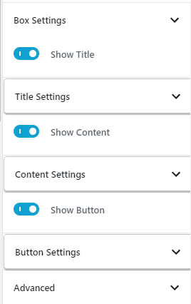
Right off the bat, you can see 3 toggle switches, which you can use to disable one of the three elements on the Call To Action Block.
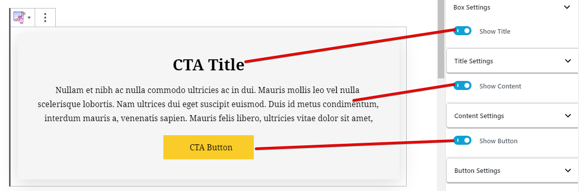
This gives you the flexibility to use the CTA Block in more than one way.
Coming to the settings themselves, they are divided into the following tabs.
- Box Settings
- Title Settings
- Content Settings
- Button Settings
Let's discuss each of the settings one by one.
Box Settings
The box settings deal with the overall look of the CTA box. Here are all the settings available for the Box Settings.
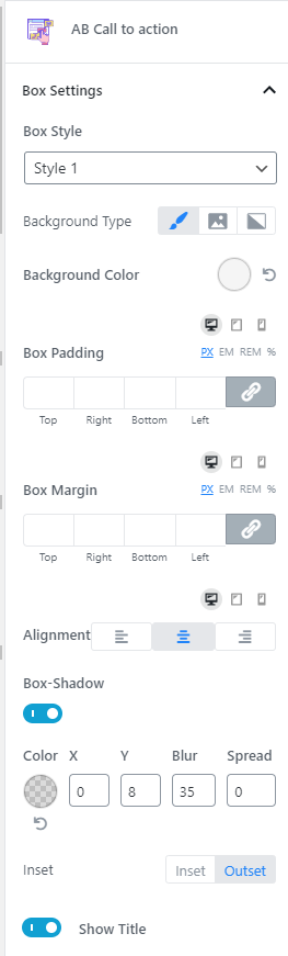
There are many settings, but they are easy to follow. We'll explain all of them in brief.
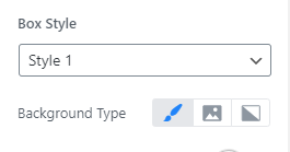
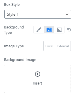
Box Style
The CTA Block supports 2 box styles. Here they are, side by side, for comparison.
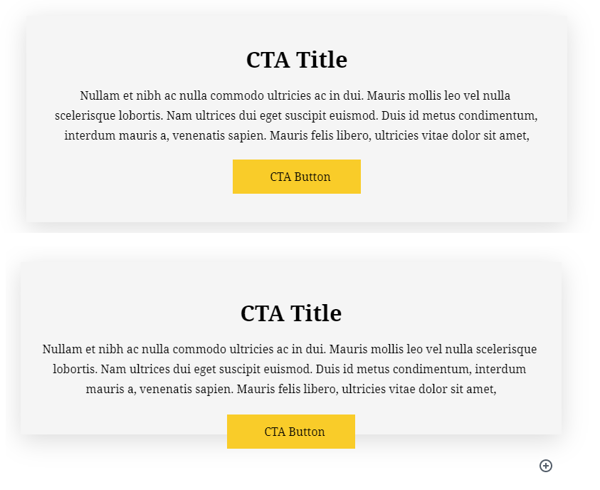
The difference looks subtle, but once you change some other settings, the differences will become more prominent. For the demo, we'll be using Style #1.
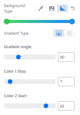
Background Type
The CTA block supports multiple background types. You can choose between a solid color, an image, or a gradient as the background.
With the image, you have the option to choose a local or an external image. For external images, you will have to provide the URL of the image for it to work.
The gradient option is pretty versatile too. You can choose 2 colors for the gradient, 2 types of gradients, and you can also customize how the gradient renders. These options make it easy to create attractive gradients with CSS, so there is no additional load time added to the page.
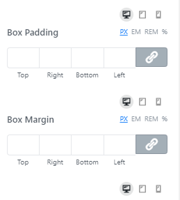
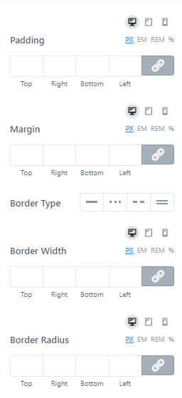
Box Padding and Margin
These options let you customize the padding and margin of the CTA block. You can customize all 4 sides individually, or together. You can also customize these options for different devices, i.e., desktops, mobiles, and tablets. You also have the option to use various CSS size options, namely px, em, rem, and %.
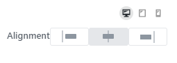
Alignment
This option lets you set the alignment of the CTA block. The title, text, and the button all follow the alignment settings. The alignment can also be changed based on the device type.

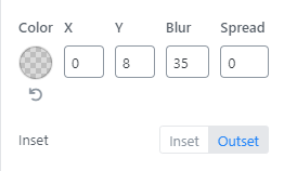
Box Shadow
The box-shadow lets you create and customize a box shadow around the box. You can change the color, blur, spread, and other dimensions. You can even set the shadow to grow outside or inside.
Title Settings
The Title Settings has only 2 options.
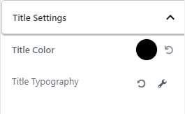
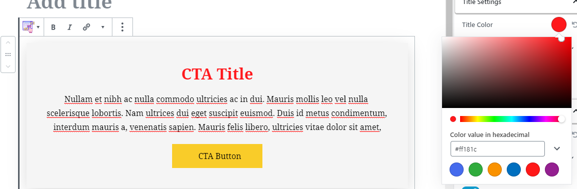
The Title Color lets you choose the color of the Title using the easy to use color picker.
To access the typography options, you have to click the wrench icon next to the setting. If you've read any other article about the AffiliateBooster Plugin or tested it out, then you know how comprehensive the typography options are. Here is another look.
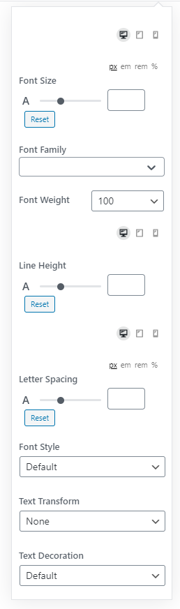
In short, you can choose the font, font-weight, line height, letter spacing, and various font styles. And, you can customize these options for the different devices out there.
Content Settings
The Content Settings are similar to the Title settings and feature only 2 options.
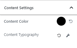
Since these options are identical to the Title Settings, there is no reason to cover them again. You can refer to the Title Settings if you want to learn more.
Button Settings
The Button Settings affect only the button in the CTA Block, and here are the settings in the block.
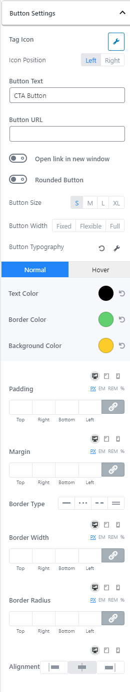
As you can see, there are many options to configure. But don't worry. We'll explain all of them in a way that they will be easy to understand and follow.
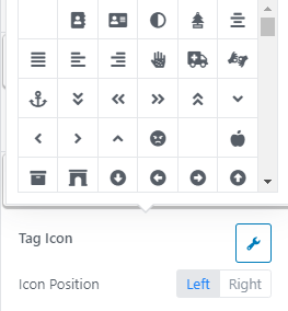
Tag Icon and Position
By default, the button only features text on it. But by using this feature, you can add an icon next to it. There are hundreds of icons to choose from, and you can also set the location of the icon on the button.
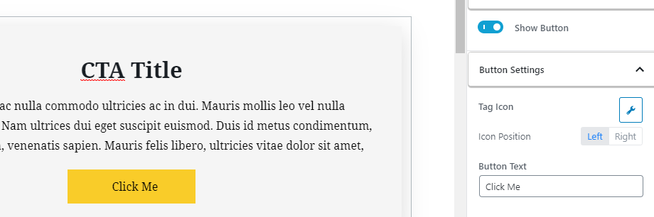
Button Text
This option lets you customize the text of the button. In short, this is where you set your actual Call to Action. You can change the text by typing it in the field, or clicking the button and typing it there directly.
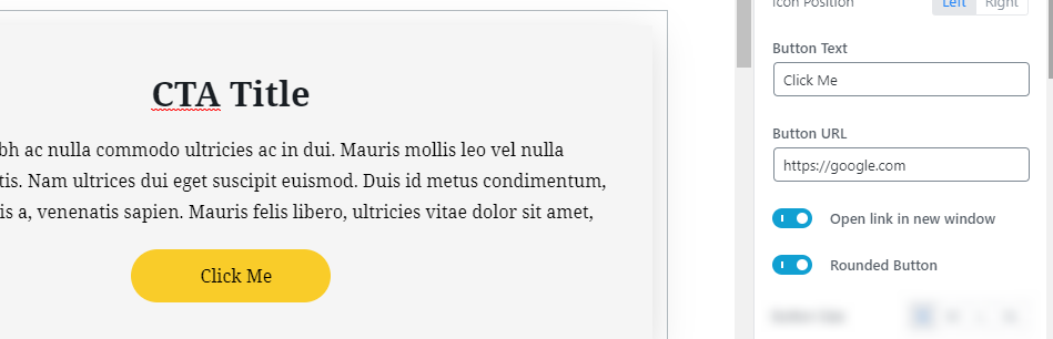
Button URL
This setting is quite obvious. Here you enter the URL where you want your button to point to. Make sure to use a fully-qualified URL like https://google.com; just google.com won't work.
You can also force the link to be opened in a new tab by enabling the toggle switch. You also get the option to make the button round using the second toggle switch.
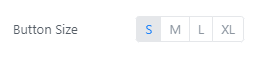
Button Size
This option lets you set the button size. You can choose between Small (S), Medium (M), Large (L), and extra-large (XL).
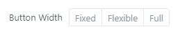
Button Width
Using this option, you can set the desired width for the button. You have the option to set a fixed, flexible, or full width.
Button Typography
You can access all the button typography features by clicking the wrench icon next to the option. Once you do, you will see all these options.
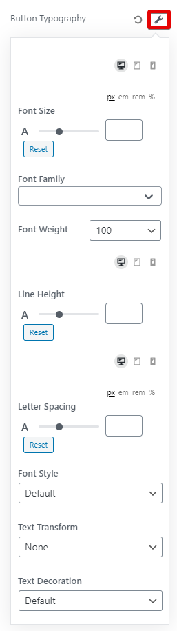
As you've seen with typography options in other settings, there are comprehensive options to customize the typography to no end. You can customize the font, font-weight, line height, spacing, font style, and many other options to create the perfect looking button.
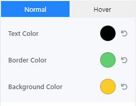
Button Colors
You can set the button colors using these options. You can set the color of the text, the border, and the color of the background. Also, you can set different colors for the hover and regular button states.
Button Padding, Margin, and Borders
These options let you set the padding, margins, and borders for your buttons. You can set them for each side separately or together. You can also configure them to be used differently based on the device that the block is being viewed on.
Button Alignment
This option lets you set the alignment for the button. You have the option to set the alignment to left, center, or right. You can also change this alignment based on the device your website is being viewed on.
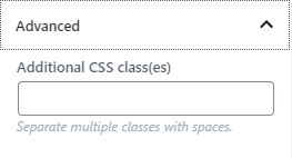
Advanced
This option lets you apply custom CSS classes to the CTA block. Since you can customize almost anything right from the block options, you will rarely need to use this option. But if you do need it at some point, you will know that the option exists.