

The Top Pick Product Block is a fantastic block that is guaranteed to boost sales and conversion. When you are talking about multiple products in a post or making comparisons, there is always a clear winner; a product that you rate the best out of the lot. Most people don’t want to spend time doing the research. Instead, they want the best product laid out in front of them.
That is precisely what the Top Pick Product Block is designed to do. You should use it on the top of the page to highlight the best product out of the lot.
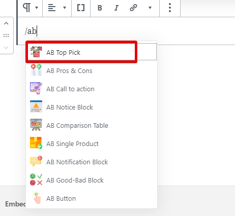
Top Pick Product Block works as a Gutenberg block, so add it to your post as any other block using the block menu.
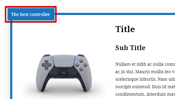
Once added to the page, it should look something like this.
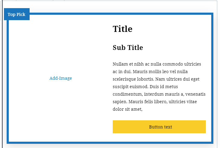
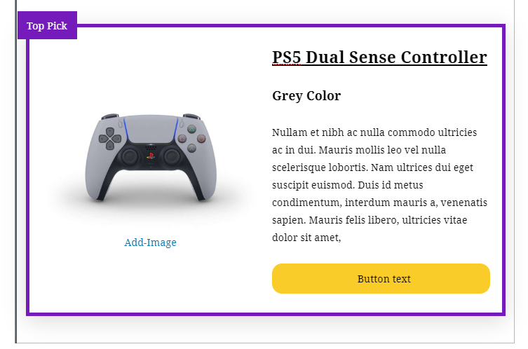
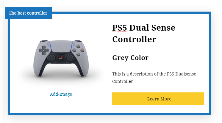
Of course, this is a barebones block. With a few seconds of work, you can transform it into something like this.
Just like any other Gutenberg block, the Top Pick Product Block has a few configurable settings. Here is a list of all the settings.

Top Pick Settings
The Top Pick Settings affects the “Top Pick” text, the border color, and other things.
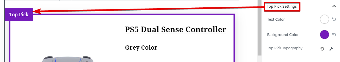
As you can see, you can change the font color, the border color, and the typography of the “Top Pick” text.
Box Settings
The Box Settings have a lot of options regarding the box. Here is a screenshot showing all the options.
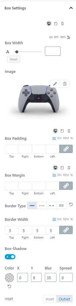
Here is a quick rundown of the settings and what they do.
- Box Width: Here you can set a custom width for the box
- Image: Here you can change or delete the image
- Box padding, margin, etc.: Set margin and padding for the box
- Border Type: Choose from different border types
- Border Width: Set a width for the border
- Box Shadow: Enable a configurable box-shadow
Title Settings
The Title Settings are basic and pretty straightforward.
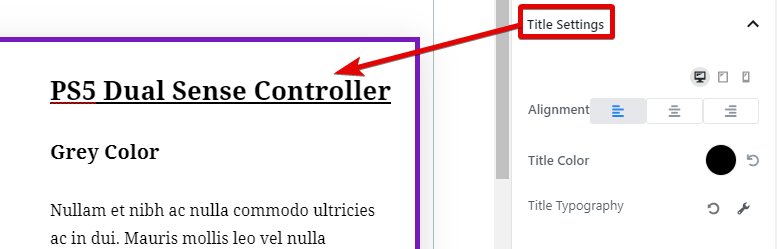
You can set the alignment of the Title, change the color, and customize the typography of the Title. The typography options have all the goodness that you’ve seen in other AffiliateBooster Blocks.
Sub Title Settings
The Sub Title Settings are identical to the Title Settings.

You can change the alignment, the color, and the typography of the Sub Title.
Content Settings
The Content Settings are identical to the Title and the Sub Title settings.

You have the option of changing the alignment, the color, and the typography of the content.
Button Settings
The Button Settings are quite extensive. Here are all the options.
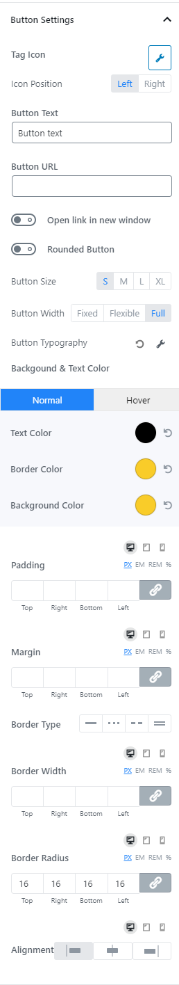
To explain the settings better, we will divide the settings into logical sections.
Tag Icon and Position
This option lets you add an icon next to the button copy. You can place the icon to the left of the text or the right.
Button Text
This is quite obvious. This option lets you customize the button copy. You can also click on the button and edit the text directly.
Button URL
Here you enter a fully qualified URL where you want the button to point to.
Open Link in New Window
Enabling this option will open the link in a new tab.
Rounded Button
Enabling this option will make the button rounded.
Button Size and Width
These options let you customize the button size and width.
Button Typography
This option lets you customize the complete typography of the text on the button. Click the wrench icon to reveal all the options.
Button Colors
These options let you customize the button colors. Specifically, the color of the button text, the border, and the background color. You can create 2 color pallets, one regular, and one for hover.
Button Padding, Margins, and Borders
These options let you customize the button’s padding, margins, and borders. You can also choose a patterned border.
Button Alignment
This option lets you align the button to the center, left, or right.
Image Settings
You can configure a couple of things inside the image settings. Specifically, you can set a custom image width and the padding around the image.
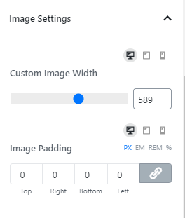
The image width has a maximum limit set by the block, and you won’t be able to override it. If you set a width bigger than the limit, it will have no effect—the image will stop growing at the limit.
The padding can help manage the spacing around the image better. You can set the padding individually or together, and also customize it based on device type.
Advanced
This is where you can add CSS classes that will be applied to the Top Pick Product Block. This feature is meant for advanced users only, and the majority of people can ignore this option and use the block settings instead.
Using the Top Pick Box
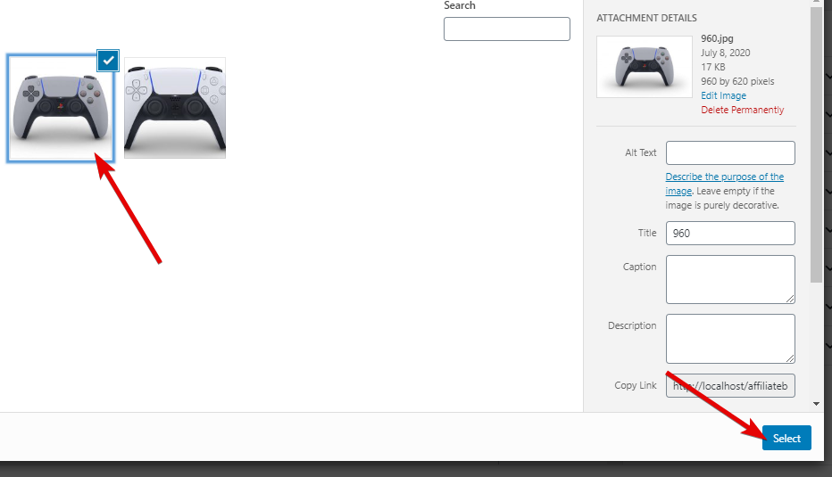
Now that you know all the settings of the Top Pick Product Block let us see how to use it in action, starting with a blank block. The first step we will take is to add an image.

We will select the image from the WordPress gallery.
Next, we will customize the Top Pick text by clicking and typing the text there.
Next, we will change the text on the button and add a Title by typing it in.
Next, we will customize some of the colors to match the branding.
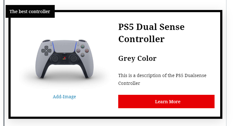
And our Top Pick Block is ready.