In this article, we are going to show you how to utilize the Pros and Cons block in the AB plugin. The Pros and Cons block is a fantastic way to showcase the strengths and weaknesses of a product and help users your users make an informed decision. When used well, it will help boost your clicks and conversions. Let us get started.
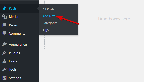
To use the Pros and Cons block, you will need to open a post or a page. For this demo, I’ll create a new post by navigating to Posts > Add New.
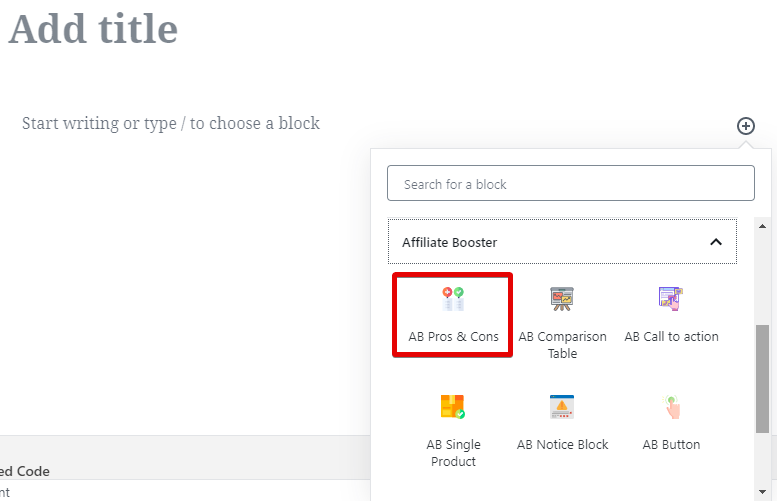
Next, we will add the Pros and Cons blocks to the post by selecting it from the blocks menu or typing “/ab” and selecting it.
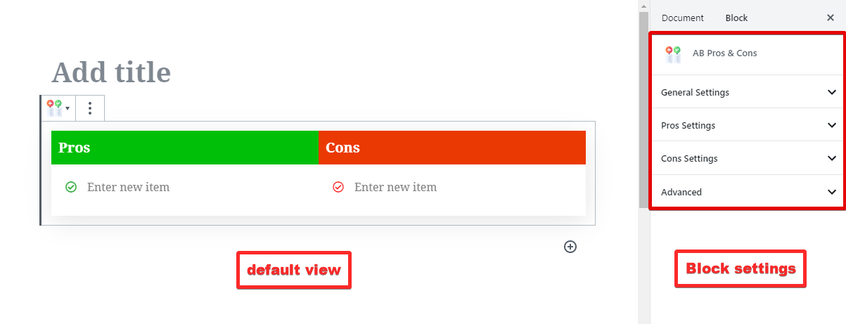
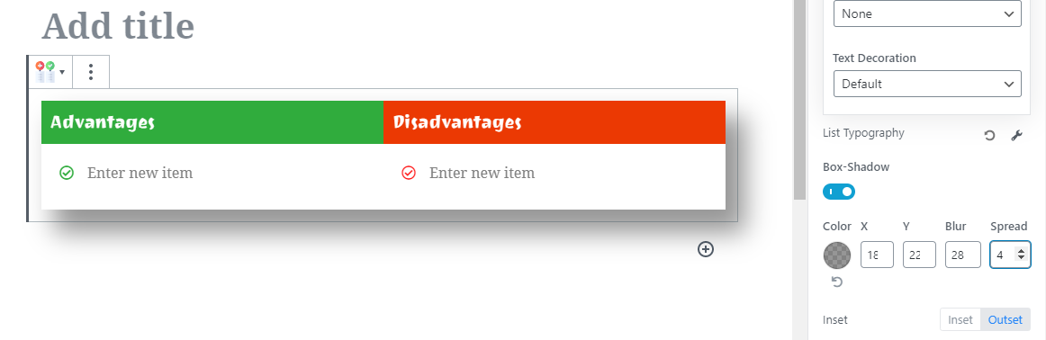
Once the block is added, you will see its default view on the post similar to this. Since this is a Gutenberg block, all the settings for the block will be available in the block menu on the right side.
Let us explore all the settings in some detail.
Options in the Pros Cons Block
As you can see from the image above, there are 4 types of settings available for the Pros and Cons block, and each of them helps in customizing a specific portion of the block. Let us explore each of the settings and explore the options.
General Settings
When you open up the general settings, these are the options that you will see.
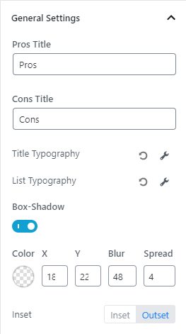
Let us explain what each of the options does.
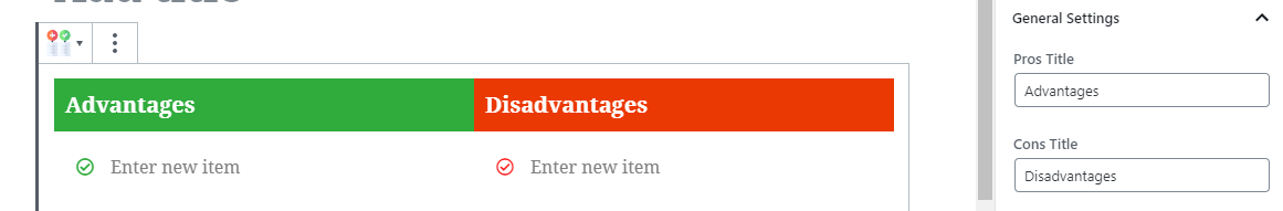
The Pros and Cons Title lets you change the titles of the headings on the block. This gives you more flexibility to create your unique block. Here is an example.
Next comes the typography options. They are divided into 2 sections.
- Title Typography
- List Typography
As the names tell you, these options will let you customize the typography of the Title and the List items, respectively. Keeping that in mind, we will explore the typography options for only the Title, as the options for the List will be identical.
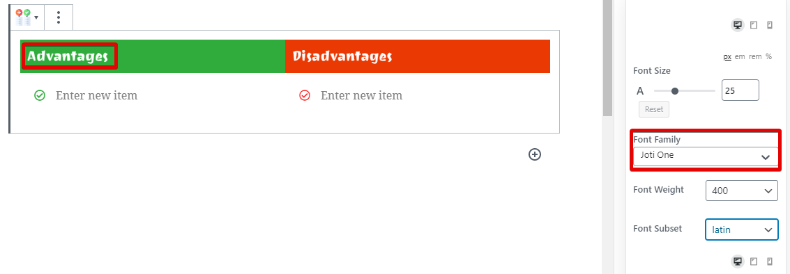
Click the wrench icon to open the typography settings. AB gives you tons of flexibility by offering granular options to customize the typography. Here are the options in the typography section.
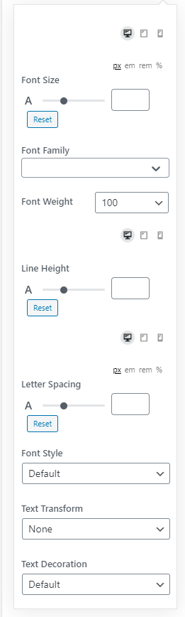
From a quick view, you can see that you can customize the following settings.
- The Font
- Line Height
- Spacing
- Font Styles
Obviously, there are multiple options under each of the settings which give you complete control over the look of the block. Let us showcase some of the options with images.
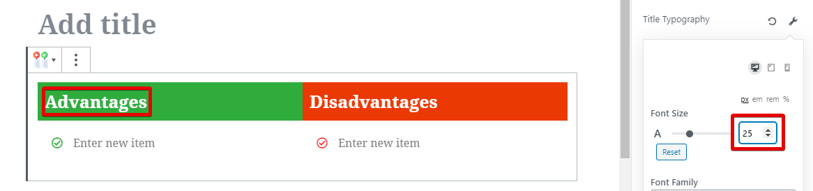
Here is an example of the Font Size option.
Here is how you can customize the fonts.
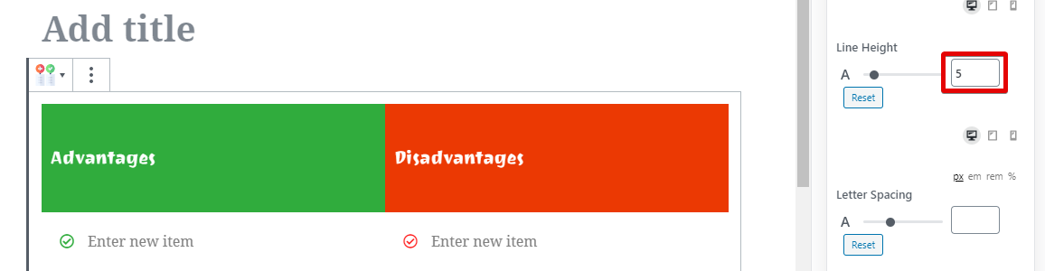
You can also change the line-height.
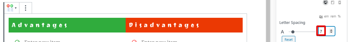
Along with the Letter Spacing.
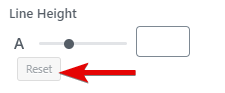
If you make any changes that you don’t like, you can always go back to the default settings by clicking the Reset button next to the setting (expect Font Family).
As you can see, you get amazing control over the look of the block. But that is not even the best part. To offer you even more granular control over the content, you can customize each of these settings for desktop, tablet, and mobile phones. It is likely that you already get more traffic from mobiles than desktops, and this feature lets you optimize your content for that. Here is how to use it.
Above each of the settings, you will see 3 icons that represent desktop, tablet, and mobile. By default, the desktop icon is selected. But, you can click on any of the other icons and optimize your settings for that particular device.
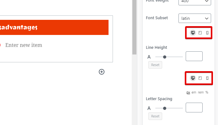
Please note that since AB plugin works with Gutenberg inside WordPress, it cannot dynamically show a real-world representation of how the content will look like on a particular device. In short, the content in your post will look the same, even if you edit the settings for other devices. You will have to check your frontend and then use a device simulator to check your content. This is a WordPress limitation, not a limitation with the AB plugin.
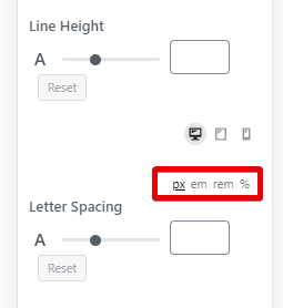
Apart from device control, AB Plugin also supports multiple CSS measurement units such as pixels, em, rem, and percentage. Using these, you can create the perfect looking Pros and Cons block.
Box Shadow
After the font settings, you will also see an option to set up a box-shadow, and it is enabled by default. Here is how it appears.
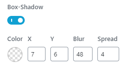
These settings control the box-shadow around the Pros Cons block. You have control over the color, the offset, blur, and spread. You can also target the shadow internally or externally. Using this feature, you can make the Pros Cons block stand out from the content. Here is an example.
Look at how 3D the block appears with a simple shadow. You can use this feature and combine it with a button or CTA block to bring more attention to your call to action.
Pros and Cons Settings
We’ve decided to combine the settings for the Pros and Cons as they are identical in all aspects; they will just affect their respective blocks. It doesn’t make sense to repeat the explanation for the blocks twice.
Here is a screenshot of all the settings in the Pros Tab.
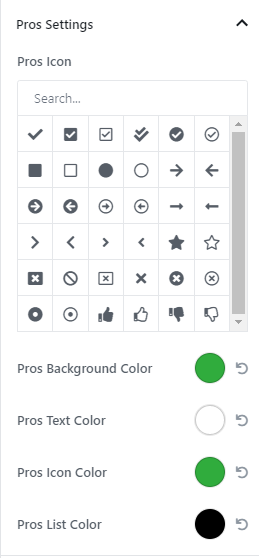
In short, you can customize the icon that is displayed for the list of Pros and Cons, the background color of heading, the color of the text, the color of the icons, and the color of the text. Since a picture is worth a thousand words, let us demonstrate with an animation.
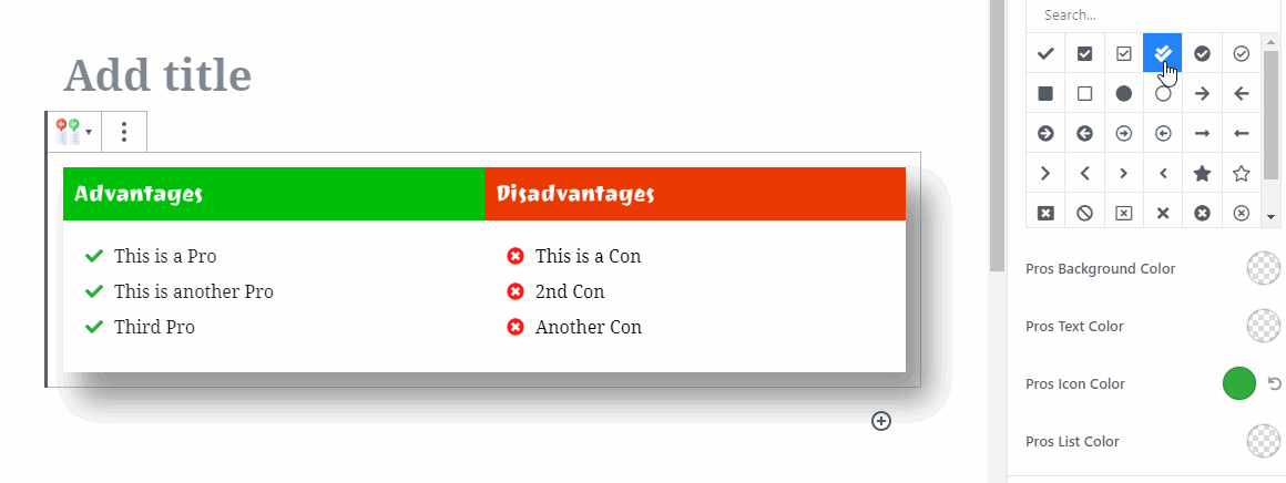

As you probably understand now, you can customize every element of the block with complete control, allowing you to match everything to your brand.
The settings in the Cons Settings section are ideal, so we won’t be covering them, as we mentioned earlier.
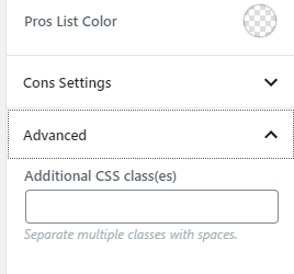
Advanced
The Advanced section is where you can place the names of custom CSS classes to quickly style your elements. With granular controls already present in the theme, there is very little need for it, but there are a couple of use cases where it might prove useful, that is why we’ve included this option.