

In this article, we’re going to talk about the comparison table block in AB. If you’ve ever created comparison tables, you know that they can be such a pain to create and manage. Not only do you have to install various plugins, but even styling them can be a tough task.
AffiliateBooster Comparison Block completely changes the game with this block, and in this article, we’ll show you exactly how it works.
Adding the Comparison Table Block
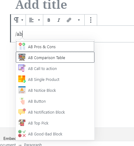
You can add the block to any post or page that you have created with Gutenberg. For this demonstration, we will be using a clean, new post. Add the Comparison Table block by choosing it from the blocks menu or typing “ /ab” and selecting it from the list.
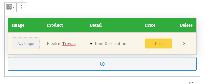
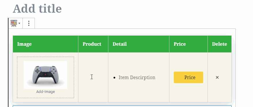
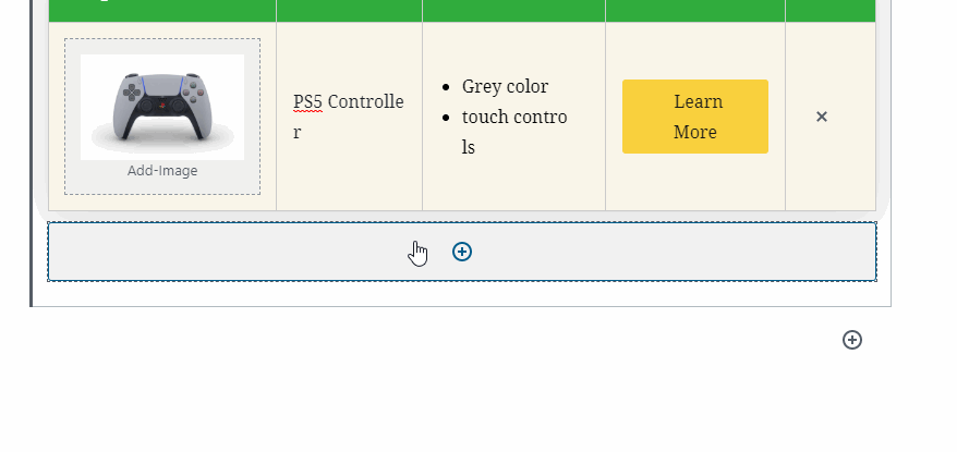
Once selected, the default table should appear on the screen, similar to this.
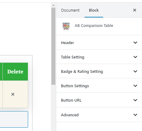
Since AffiliateBooster Comparison Table is a Gutenberg block, you will find all its settings on the right side menu, just as you’d find for any other block.
We will first explore the table a bit; then, we will explore all the settings that you can customize from the block.
CT Settings
Creating a table using the Comparison Table block is pretty straightforward, fast, and easy. These are exactly the opposite of the current solutions out there, which make the Comparison Table Block one of the best on the market. Let us show you how to use the Comparison Table block.
The Comparison Table has 4 columns.
- Image
- Product
- Details
- Price
Image
This is where you add an image for the product you are selling. Click the “Add-Image” section to open the WordPress media manager and add an image.
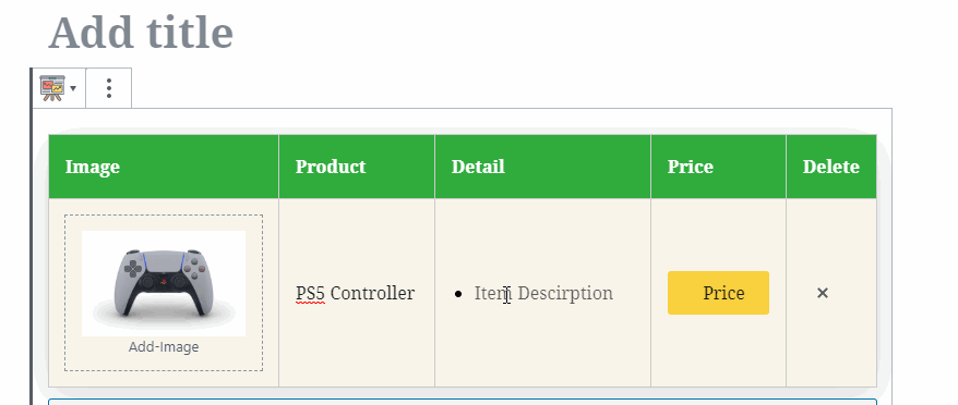
Product
In this section, you should ideally add the name of the product that you are promoting. Simply click on the section and start typing a name.
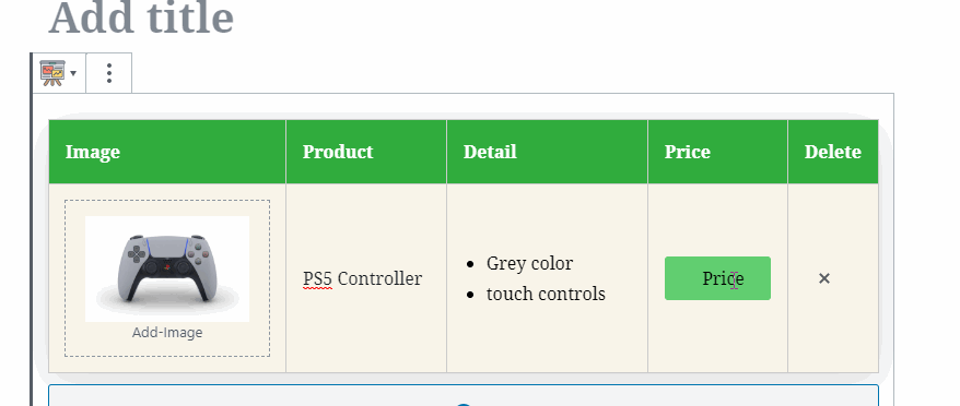
Detail
The detail section has an unordered list by default and should be used to highlight the most important features of the product being promoted. Similar to other sections, you simply have to click the section and start typing the details in.
Price
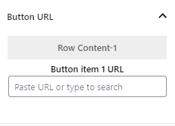
The price tab has a button by default, and this should be your CTA for the user to click and purchase the product that you are promoting. You can customize the label of the button by clicking it and typing a new one in.
The URL which the button will point to can be configured in the Button URL section.
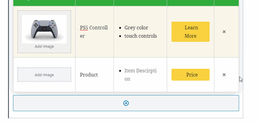
Adding New Rows
To add a new row or product to the Comparison Table, you just have to click the “+” sign at the bottom of the table.
Deleting Products and Rows
If you’d like to delete a product from the table, simply click the “x” icon in the last tab corresponding to the row you want to delete. The delete tab does not show up for the user, it is only visible to you.
CT Block Level Options
Header
The header options are quite simple. They let you customize the header text on the Comparison Table. This image will tell you everything you need to know.
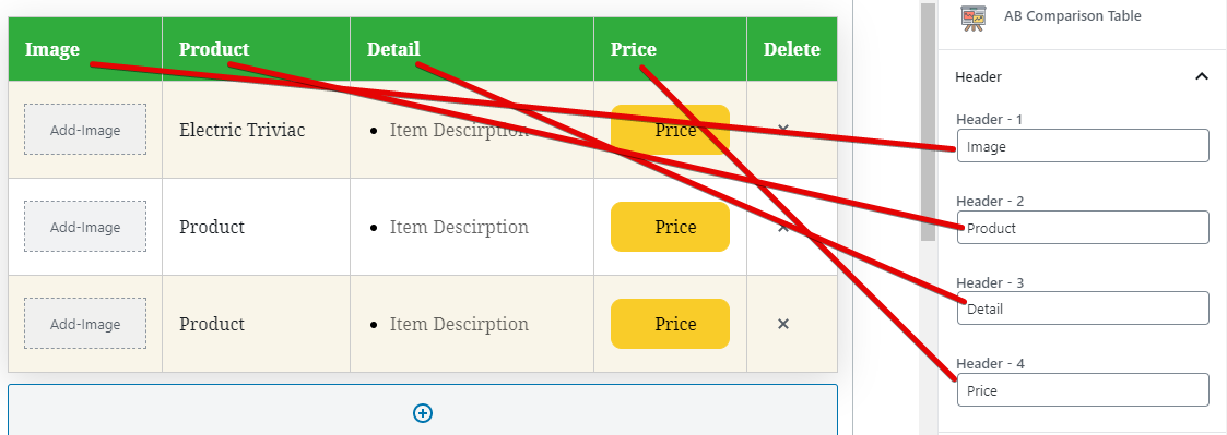
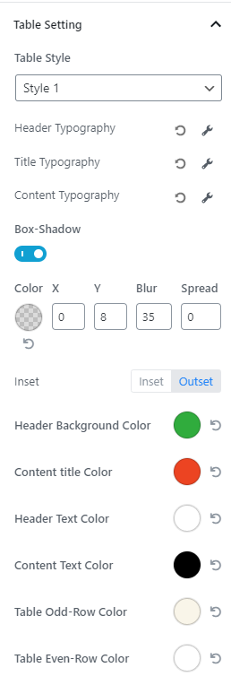
Table Setting
The Table settings are where the magic happens. It is where you will design the table elements and make them your own. It is also the most complicated part of the Comparison Table block, so pay attention.
If you open the Table Settings, this is what you will see.
Not too complex, right? It is; wait for the complicated stuff.
The settings are pretty straightforward here. Here is a list of the settings and name themselves should explain what these do.
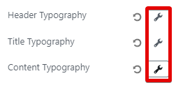
- Header Typography
- Title Typography
- Content Typography
- Box Shadow
- Header Background Color
- Content Title Color
- Header Text Color
- Content Text Color
- Table Odd-Row Color
- Table Even-Row Color
Please note that the Header, Title, and Content Typography can be further expanded to reveal more granular controls by clicking the wrench icon next to them.
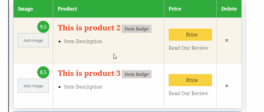
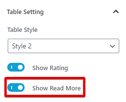
Now comes the interesting part. If you didn’t notice, the TC table supports table styles, and the default setting is set to Style 1. Lets set it to Style 2 and see what happens.
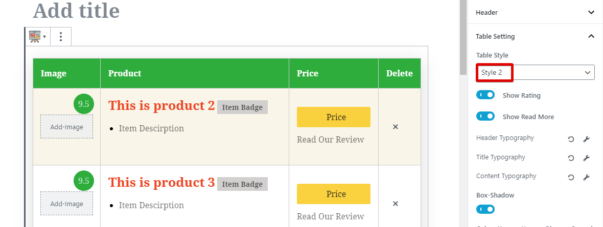
Woah! The entire table has changed, and a few new things have opened up. Specifically, 4 new options are available on the Comparison Table now, and here they are.
- Rating
- Title
- Badge
- Read More
These options make the table more useful, powerful, and possibly high converting. Let us discuss these options specifically now.
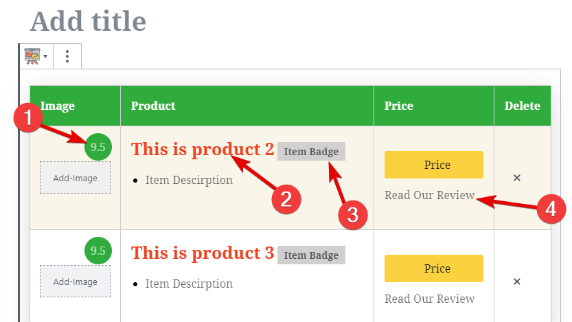
Rating
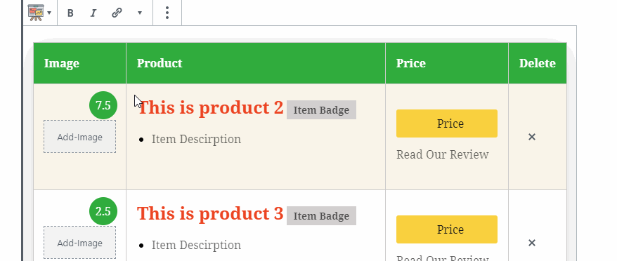
This option lets you set a rating for each product that you add in the Comparison Table. To change a rating, simply click the rating itself and type in a new rating.
You can also turn off the ratings completely from the Comparison Table using the toggle below the Style dropdown.
Title
In table style 1, the Product tab has only text, and there are limited options to customize it. When you choose style 2, the tab includes a Title, and the text falls below it.

ou can now customize the title completely using the block settings. Specifically, you can customize the typography and the color of the header using the settings.
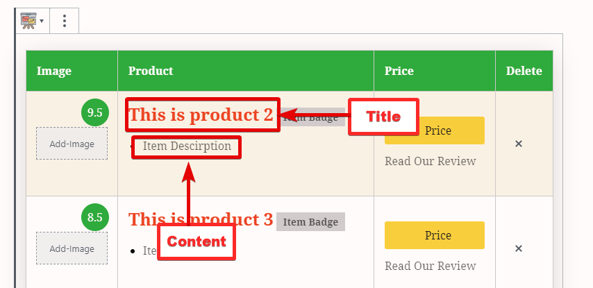
This option will be very useful to highlight products and generate more sales.
Badge
The badge is a quick way to segment products and helps users decide which product excels at which things. For example, a badge could say that a product is “the cheapest,” and another badge could say that it is “excellent VFM” (value for money).
To edit badges, simply click the badge and enter the badge text you’d like to show.
Unlike ratings and read more, badges cannot be turned off when table style 2 is selected.
Read More
Many times a comparison table isn’t enough for the users to make a decision directly. In those cases, you could add a link to your individual product review, where users can read more about the product and hopefully purchase it.
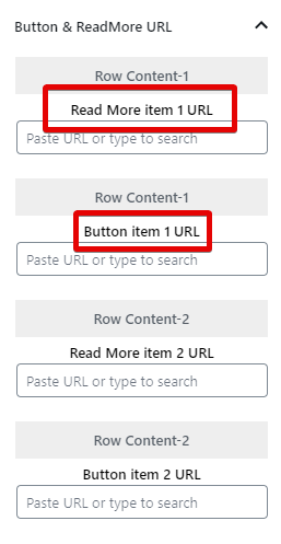
The Read More option lets you do exactly that by inserting a link just below the button. You can set the URL of the product review at the same place where you set the URL of the buttons.
If you don’t want to use this feature on a particular Comparison Table, you can turn it off by using the toggle switch just below the Style dropdown.
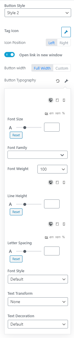
Button Settings
The button settings have everything to do with the buttons, how they look, and how they behave. Before we dive into the individual settings, here is an image of all the settings available for buttons.
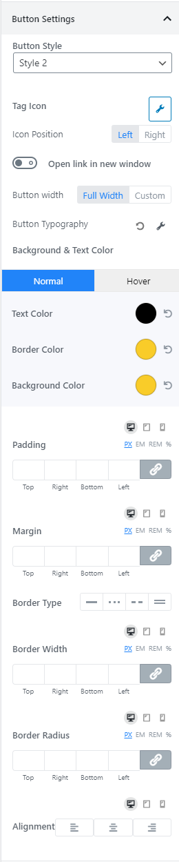
As you see, there are many options here. Most of them are easy to understand and even self-explanatory. So, instead of going deep into each setting, we will give you a brief overview of the settings.
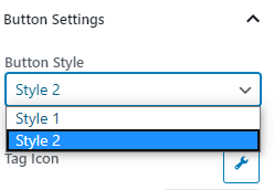
Button Style
With this setting, you can quickly toggle button styles. As of today, there are 2 styles available.
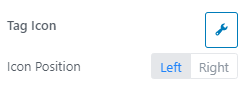
Tag Icon and Position
You can place an icon on the button if it adds value to your table. There are plenty of icons to choose from, and you can also toggle if you want to place the icon on the left of the text or the right.
Open Link in New Window
If you want the link in the button to open in a new tab, enable this option.

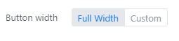
Button Width
This option lets you define a custom width for your button. In most cases, the default option is the best.
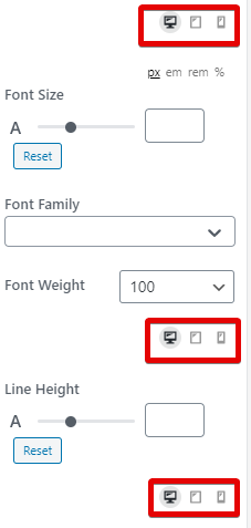
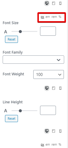
Button Typography
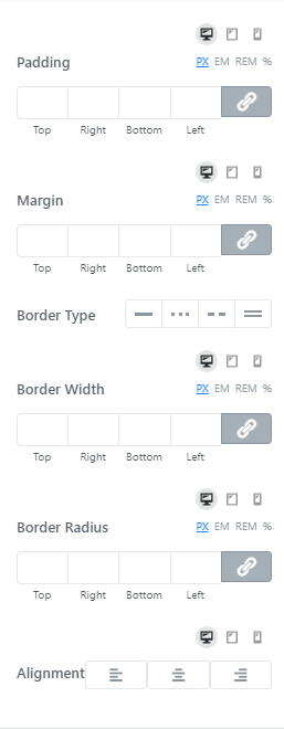
The typography options is a web in itself. You probably won’t customize all the settings, but it can’t harm you to understand them. Here is an image showing all the settings in the typography section.
Explaining all of these settings will make this article too long, so let us cover them in brief.
First things first. All the text properties that you customize can be customized for desktop, tablet, and mobile traffic differently. All you have to do is select the icon on top of the setting to change the setting for the specific device.
The settings also support various CSS sizes, namely px, em, rem, and %. Use them as you see fit.
Now coming to the settings themselves.
- Font Family - Lets you choose a specific font type
- Font Weight - If your font supports different weights, you can choose from one here
- Line Height - Lets you change the line-height
- Letter Spacing - Lets you change the letter spacing
- Font Style - Lets you pick a font style if your font supports it
- Text Transform - Lets you change your text’s case
- Text Decoration - lets you underline, overline, and do other things to text
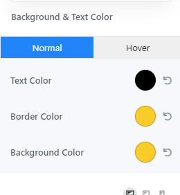
Button Background and Text Color
These settings let you change the text color, the border color, and the background color for the buttons. You can also customize the settings for when the button is hovered on with a pointer.
Margins, borders, and Other Settings
In this set of settings, you can set the margin, border, and padding for the buttons. Each of these settings has the same controls, which we discussed earlier. Last but not least, you can also set the alignment for the button.
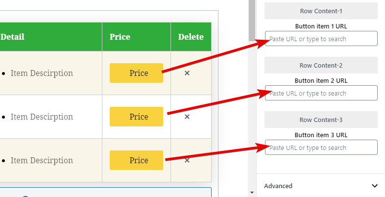
Button URL
The Button URL is the simplest setting to configure. Here you enter the URL of the page (ideally your affiliate link) that you want the buttons to link to. The number of URLs will always be equal to the number of rows you add to the table.
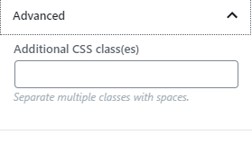
Advanced
The Advanced Tab lets you add some CSS classes to the Comparison Table, which you can use to customize the look of the Comparison Table. Although all the possible options that you can imagine have been added to the Comparison Table block, there are a few scenarios where this can prove useful. That is why this feature has been included.